PACKAGING DESIGN
DE ROOS GIN
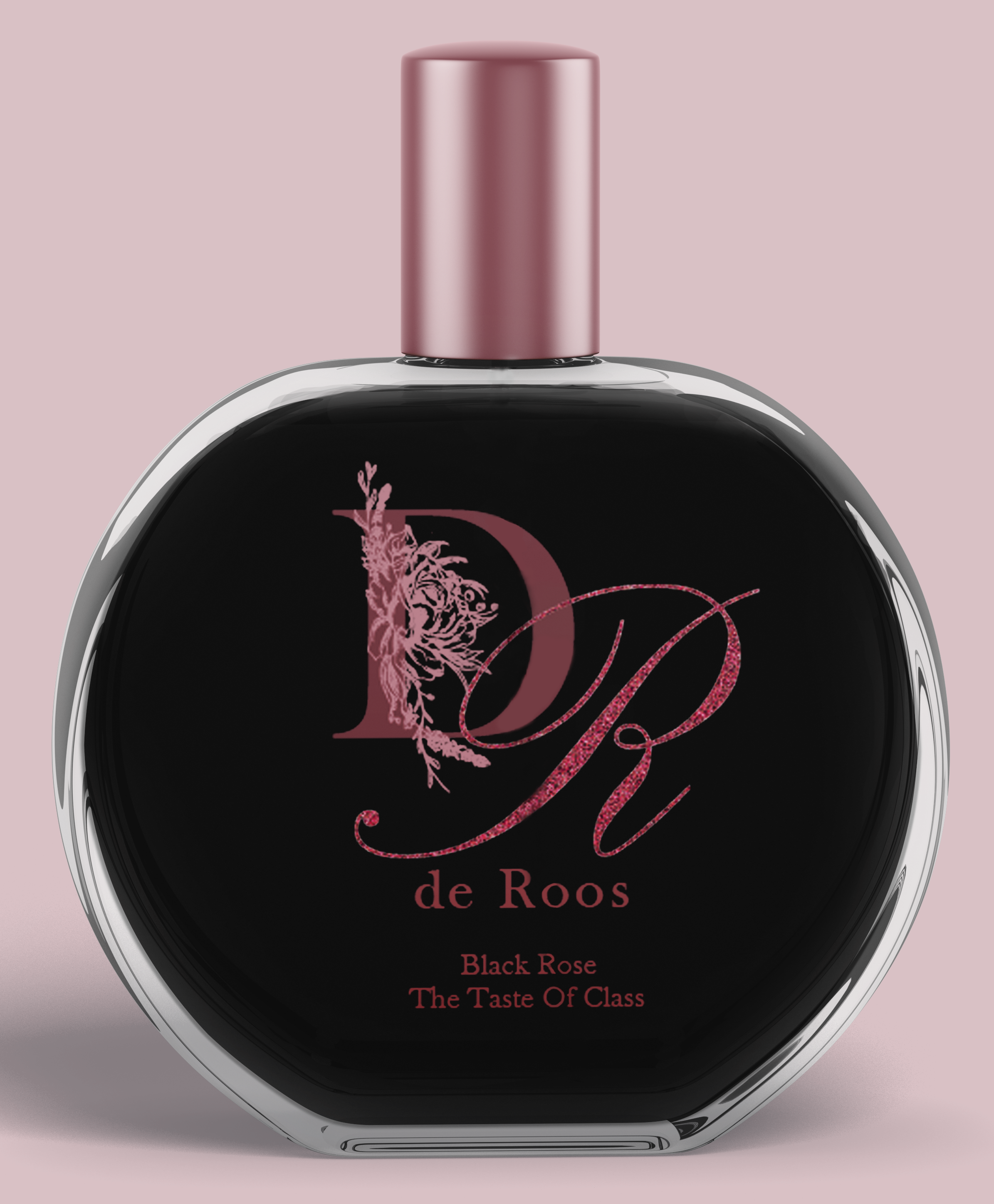
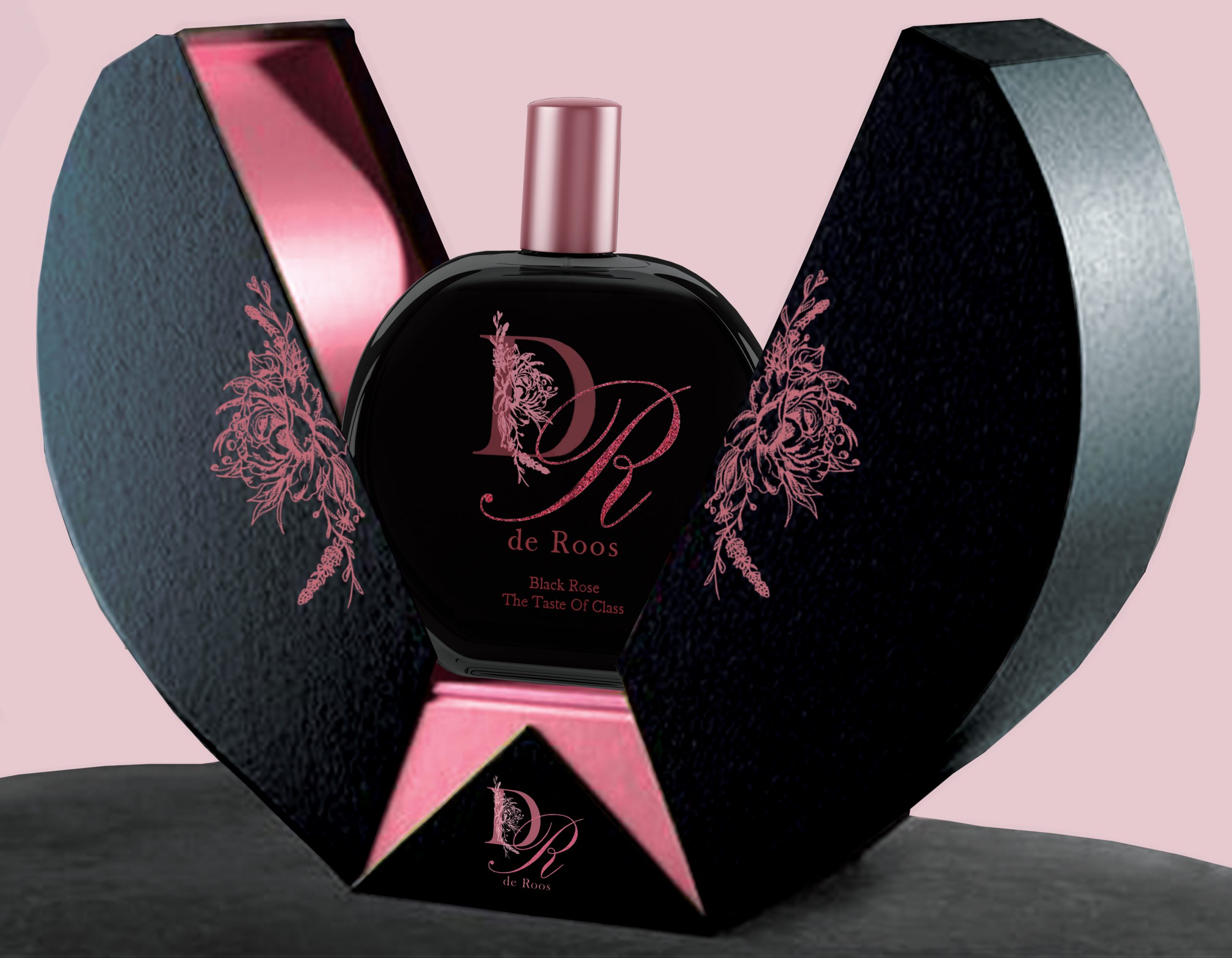
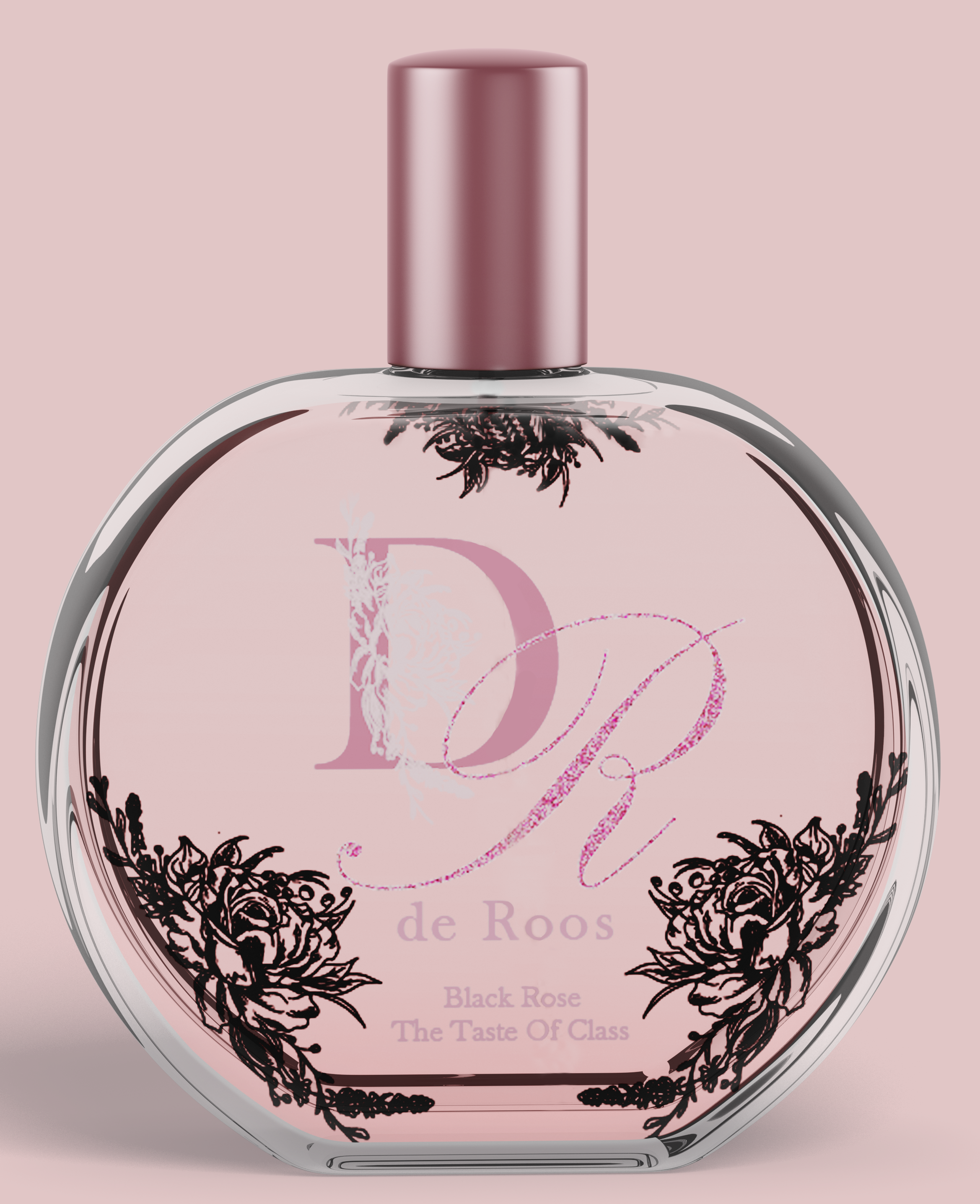
The brand challenge involves crafting a sophisticated craft beverage for a luxury gin brand, with a focus on creating a visually appealing packaging displayed at the point of sale, tailored to the South African market. The initiative aims to develop an innovative and inspirational packaging design for shelves in South Africa, emphasizing sustainability and renewability.
The key insight suggests a preference for high-end alcohol beverage packaging that is elegant, classy, and simplistic with slight detailing. The proposed approach is to design packaging that is simple yet elegant, with a unique pouring system where black font designs on the bottle become visible only when the black liquid is poured out.
The key message is to change the narrative of the prevailing perception of alcohol as unhealthy and challenge the notion that the quality and experience of an alcoholic beverage brand are determined solely by packaging. The strategy involves crafting packaging that is both simple and luxurious, aligning with the purpose of the gin to offer a unique and visually appealing experience that is also appetizing.
The concept “Class in a Bottle,” center’s around the elegance and luxury associated with roses, aiming to evoke a sense of prestige. The gin is envisioned as a black liquid infused with butterfly pea flower, native to Africa, changing the gin’s colour to purple when tonic is added. The packaging, featuring a circular shape and a minimalistic design, complements the brand name “De Roos” (Dutch for The Rose), with a tagline – “The Taste of Class.”
The colour scheme comprises matte black, rose gold, and pink. The Black Rose flavour, incorporating plum, rosemary, lavender, and ginger, emphasizes a surprising contrast with the unique colour-changing element. The intricate flower designs on the bottle, revealed during pouring and when the bottle is empty, add a decorative touch, enticing users to keep it as an element of decor. The overall concept aims to challenge stereotypes associated with the color black in alcoholic beverages, offering a light, vapour-infused gin with connotations of elegance and luxury.
Mixed Media: Illustration, Technical drawing.
Software: Illustrator, Photoshop.
LDYS CHAMPAGNE
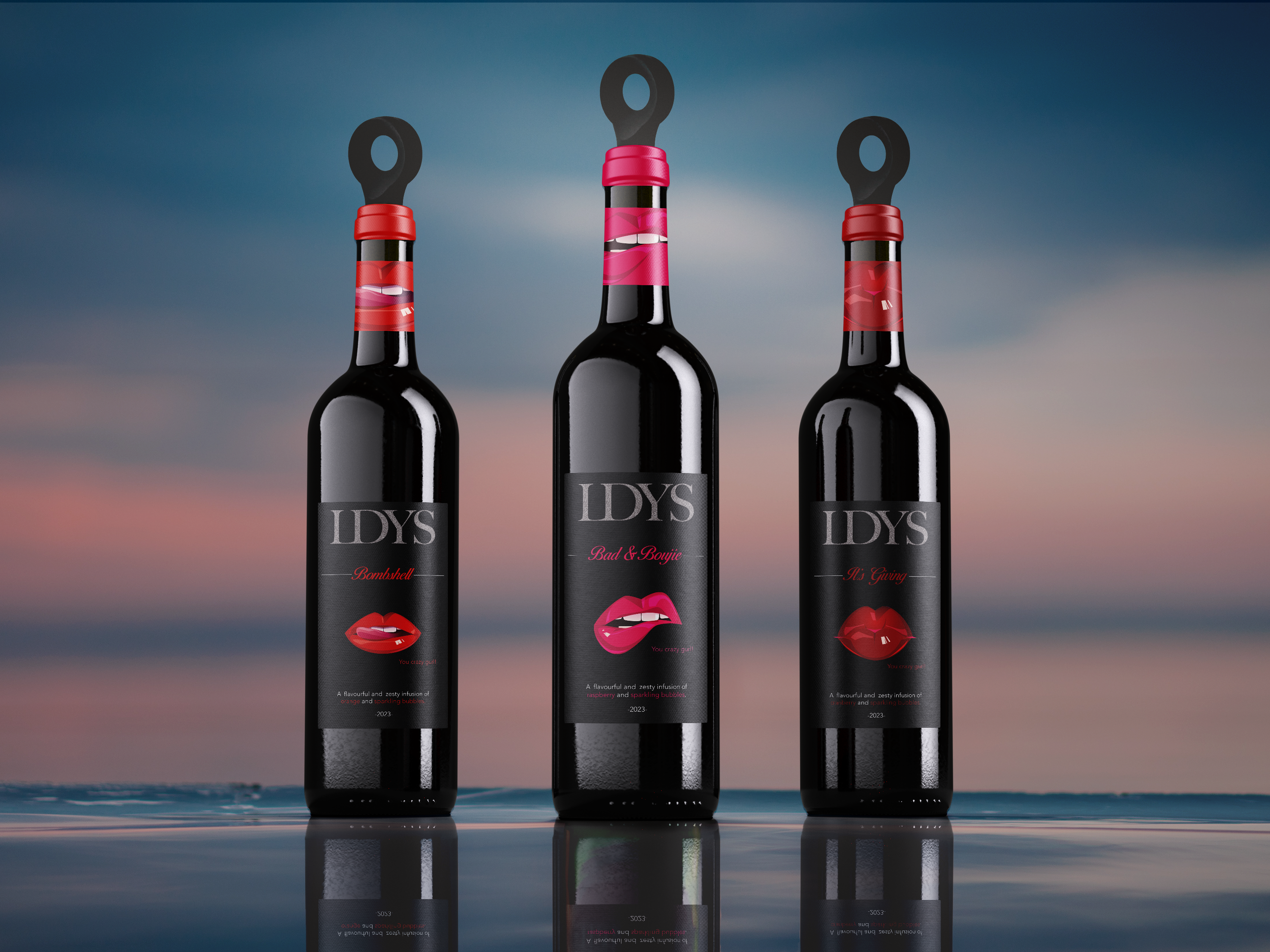
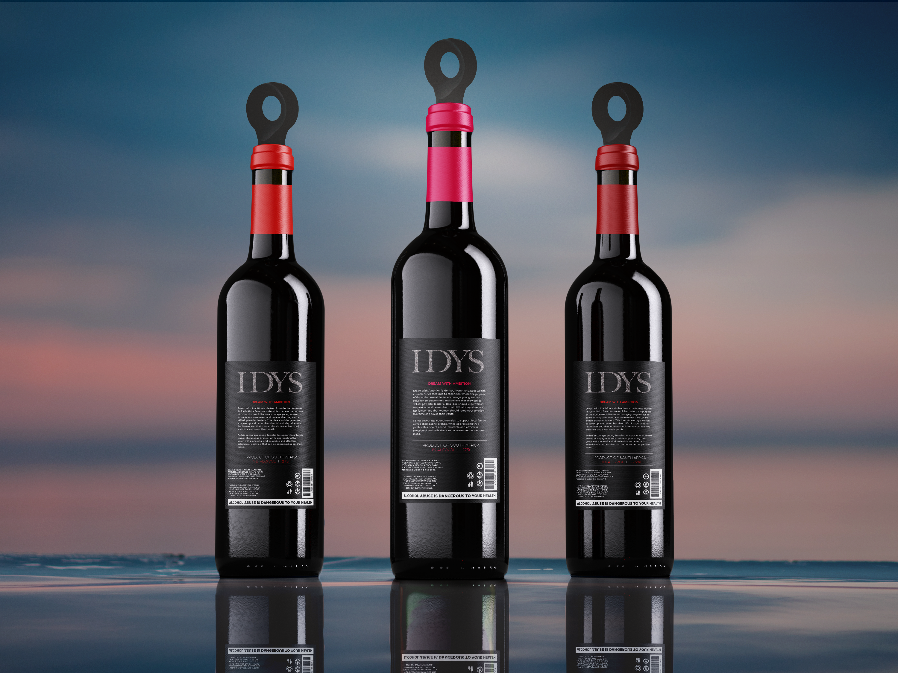
The brand challenge involves creating a fully developed beverage for a premix champagne cocktail brand, with a focus on making the packaging a competitive edge in the market category. The initiative aims to create attention-grabbing and distinctive packaging, with a particular emphasis on empowering women. Additionally, the packaging design incorporates a rare, efficient function while aligning with sustainability and renewability goals.
The key insight suggests a champagne bottle with a resealable feature, achieved through a design incorporating a reusable cork as the cap, as well as, the packaging’s aesthetic and attention-grabbing design significantly influences the overall quality and brand experience, emphasizing the importance of relatability to the viewers.
The key message encourages the females to support local female owned brands and become empowered, fearless women who strive for excellence while still experiencing and savouring their youth.
The chosen concept, “Dream with Ambition,” is inspired by the challenges faced by women in South Africa due to feminism, aiming to empower young women to aspire for leadership and skill development while reminding them to savour their youth; the brand, named LDYS, features a tagline of ‘You Crazy Gurl.’ The unique selling point (USP) centres around a reusable lid design for champagne bottles, addressing the issue of reducing air pressure, preserving bubbles and fizz after opening, allowing for easy saving of the champagne for later use without spoilage.
Mixed Media: Graphite, Fine Liner.
Software: Illustrator, Photoshop
EDITORIALS
BLACK DAGGER BROTHERHOOD
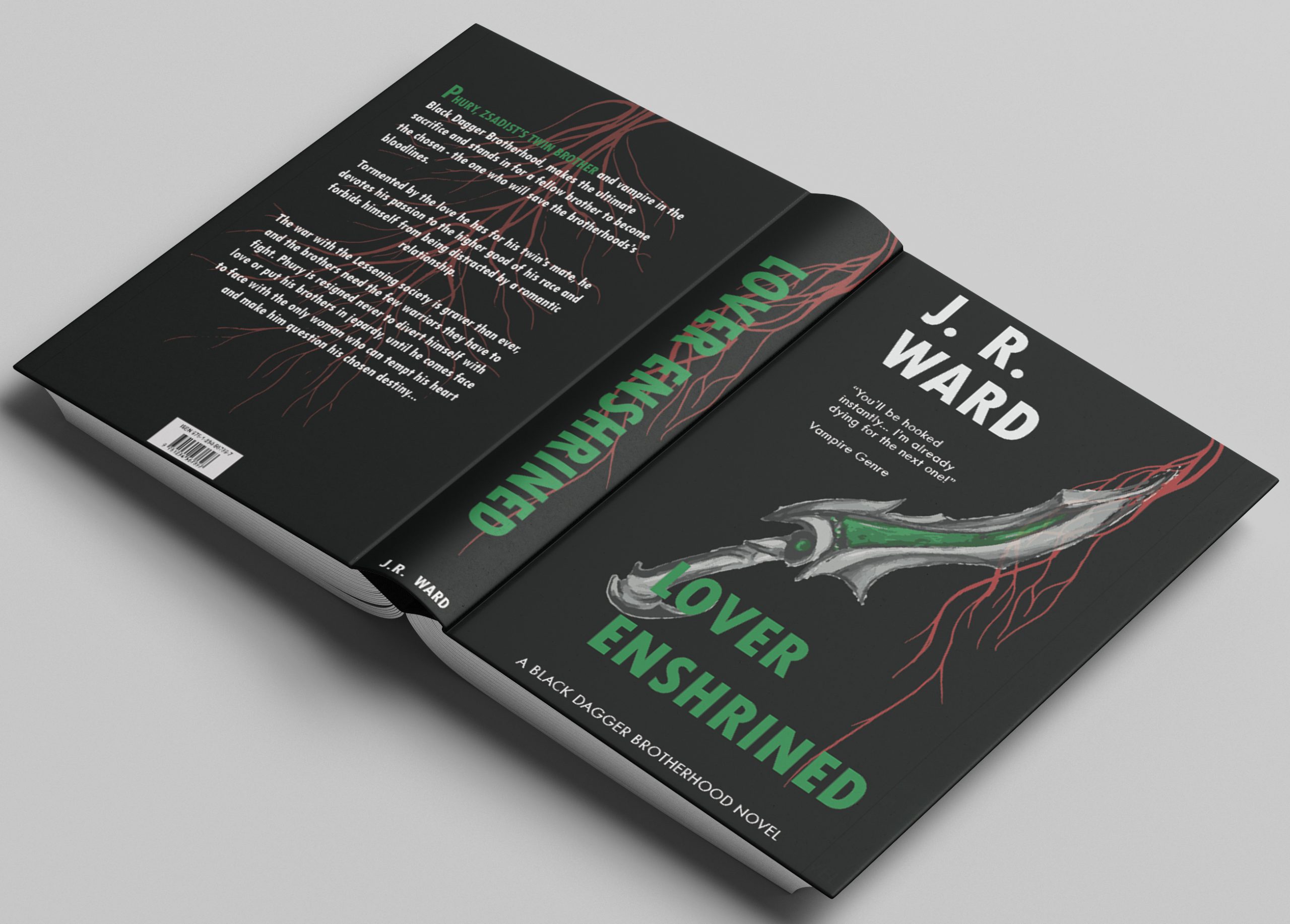
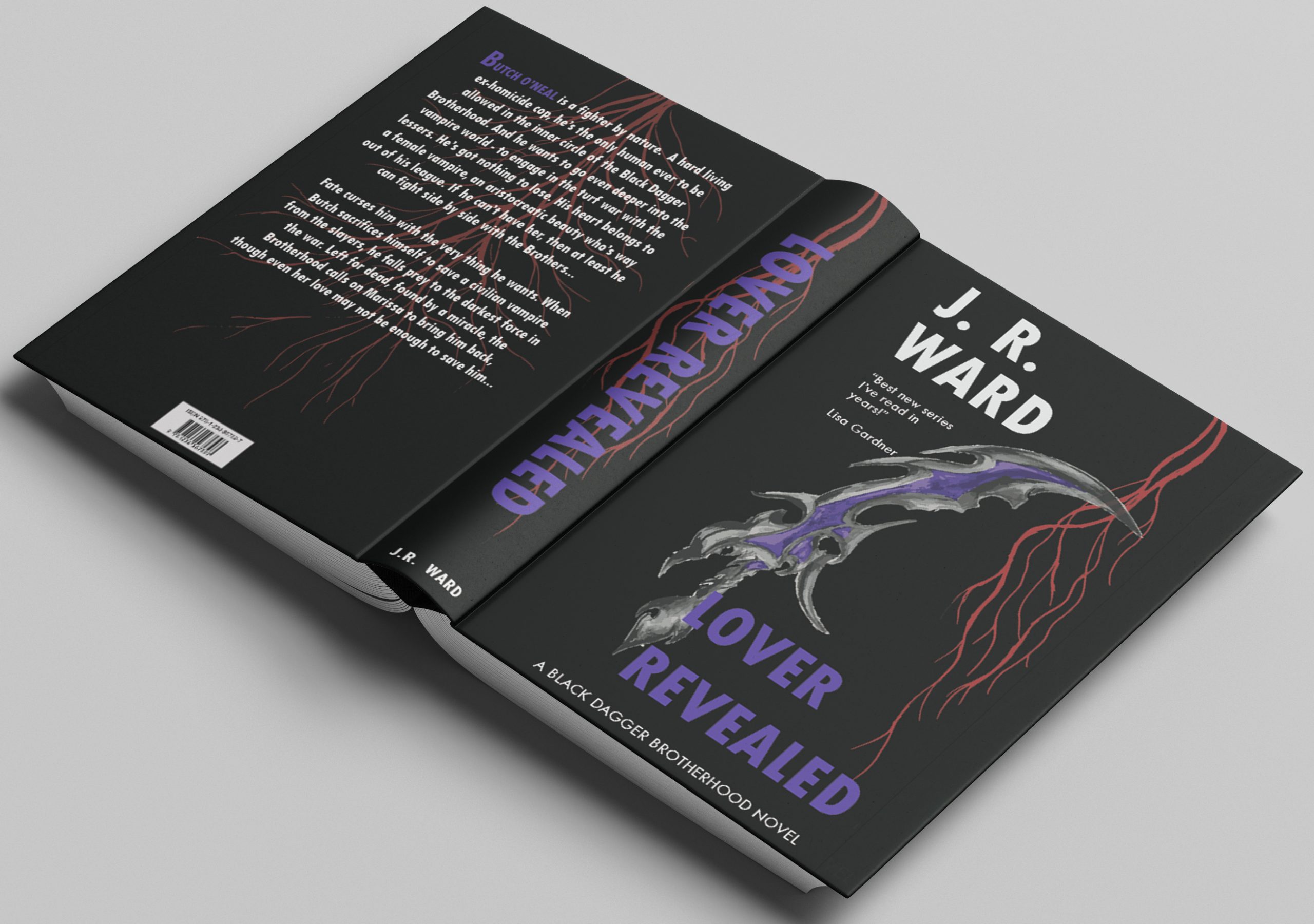
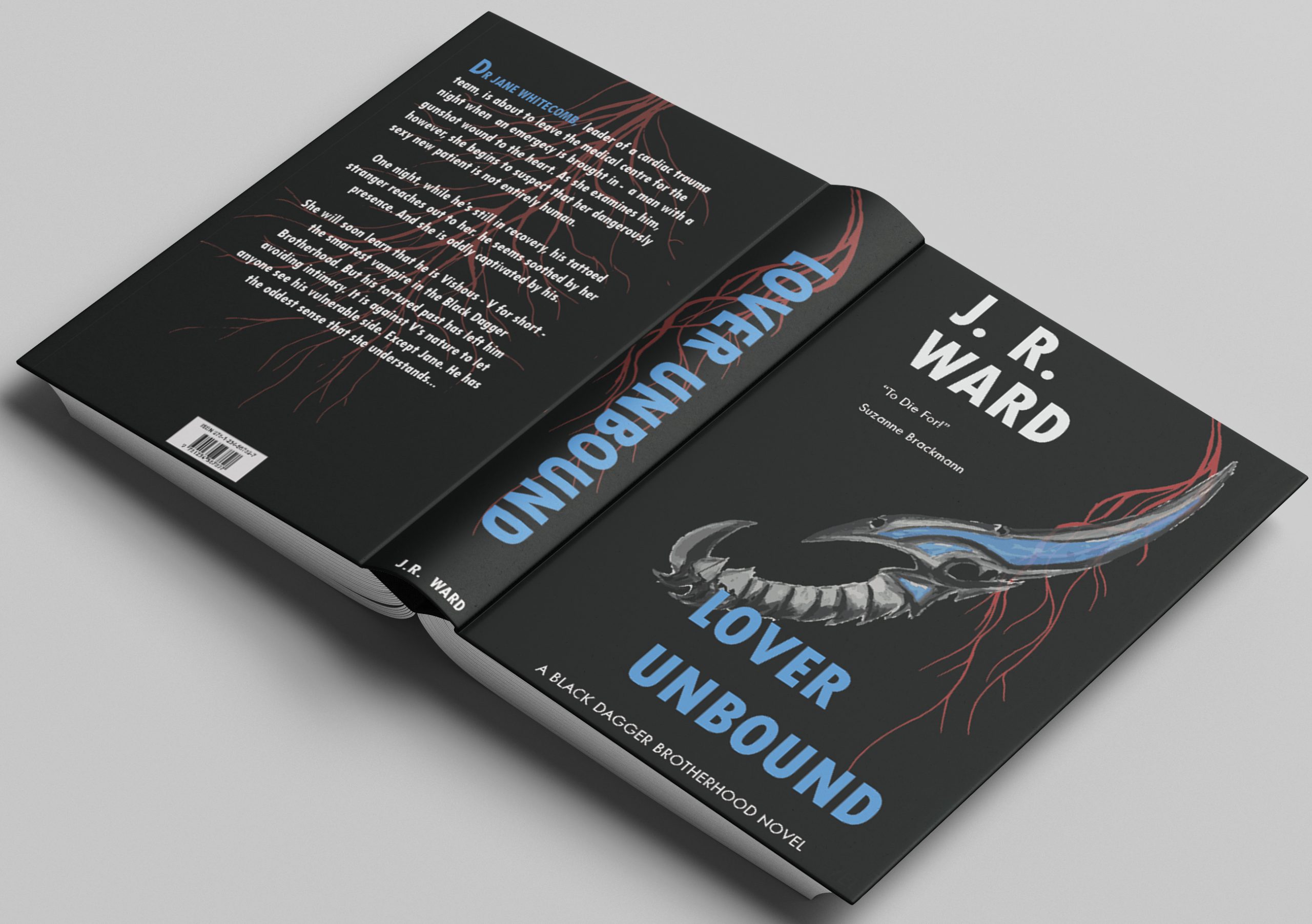
This editorial illustration for the Black Dagger Brotherhood series by J.R. Ward, specifically focusing on the books Lover Enshrined, Lover Unbound, and Lover Revealed. Centering the concept around vampires defending their race, the key element became the daggers, significant in the books as each vampire wields specialized daggers representing their character. To evoke the immortal and cold nature of vampires, a striking contrast is introduced by incorporating blood-red veins to symbolize their adversaries.
Mixed Media: Acrylics, Fineliner, Oil Pastel, Colour Pencil Software: Illustrator, Photoshop.’
CAMPAIGNS
WESTRIDGE
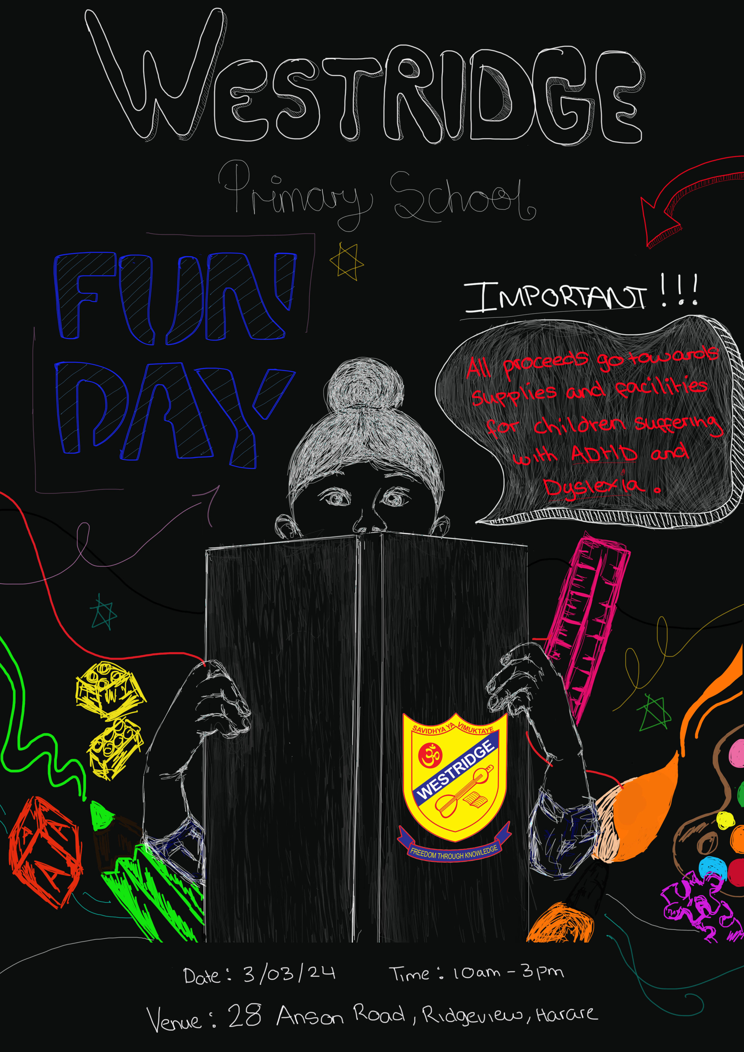

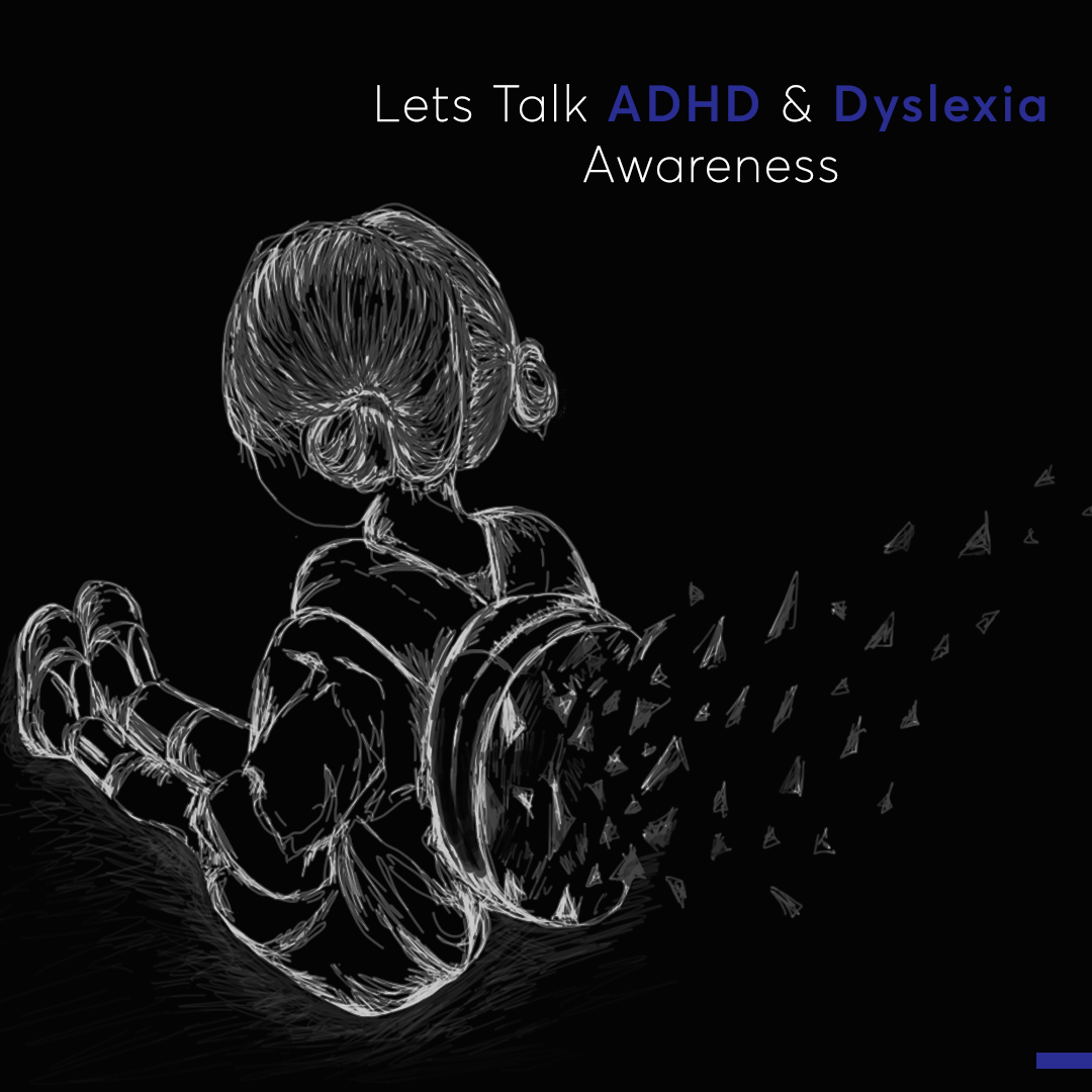
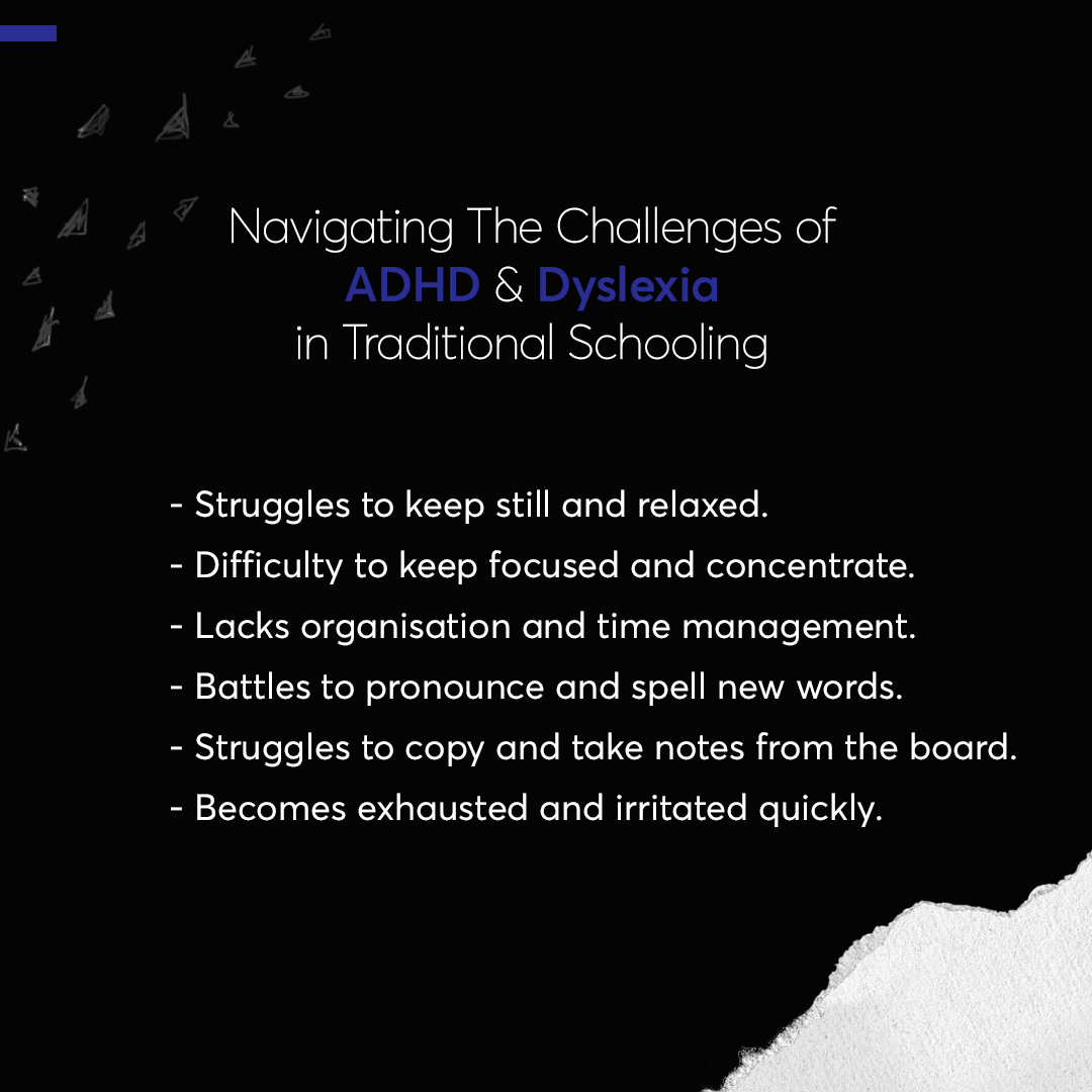
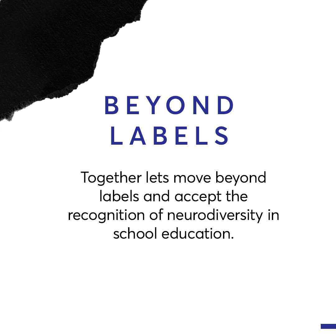
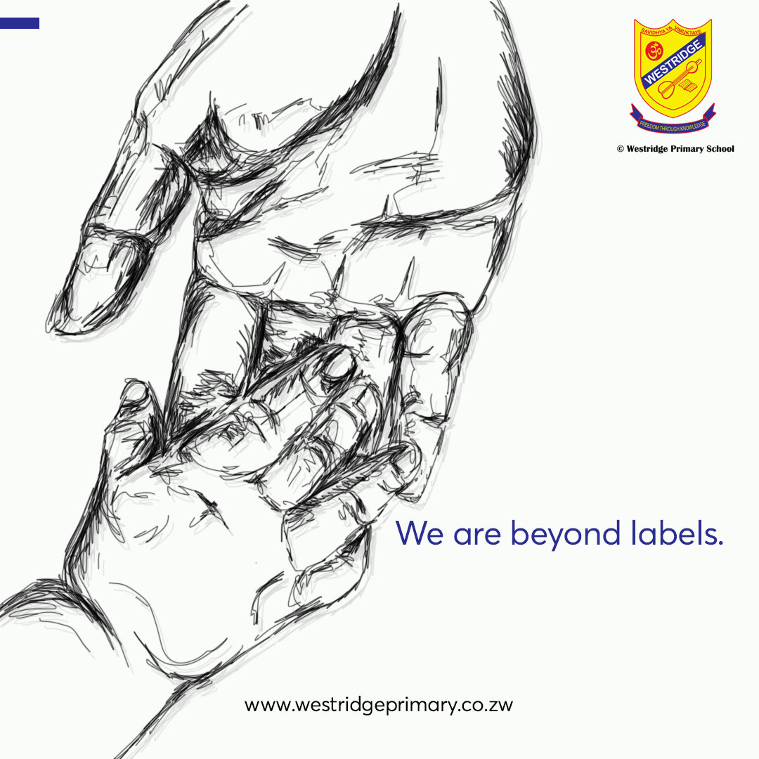
The problem resides in that school systems are standardized and caters for ‘normal regular children’ without taking care and catering to children with special needs such as ADHD, dyslexia and autistic children. In addition, tests and examinations are standardized in which an intelligent student that suffers with dyslexia and struggles with basic spelling, reading and writing, will not be able to score well.
The objective of the initiative is to develop effective methods to assist the school in implementing resources that betters the education system for children who suffer from special needs and implement training for teachers.
The key insights reveal that children may struggle with learning due to a lack of resources, potentially leading to demotivation and a sense of division in the classroom. Additionally, staff members may feel overwhelmed, lacking understanding of the specific needs of children with learning abilities and struggling to provide efficient knowledge and individualized engagement, resulting in frustration for the teachers.
The key message expressed is ‘Don’t judge a book by its cover.’ To raise awareness of the challenges faced by children with special needs studying in a standardized schools and encourage the improvement of facilities, supplies and specialized teachers to cater to and enhance education for these children.
This concept ‘Beyond Labels’ is designed to encourage and foster the acceptance and recognition of neurodiversity in primary school education, in which a change in teaching methods from a deficiency-based approach to a potential based approach should be encouraged and implemented. The deliverables for this campaign is a poster, a facebook carousel and reading guiding cards.
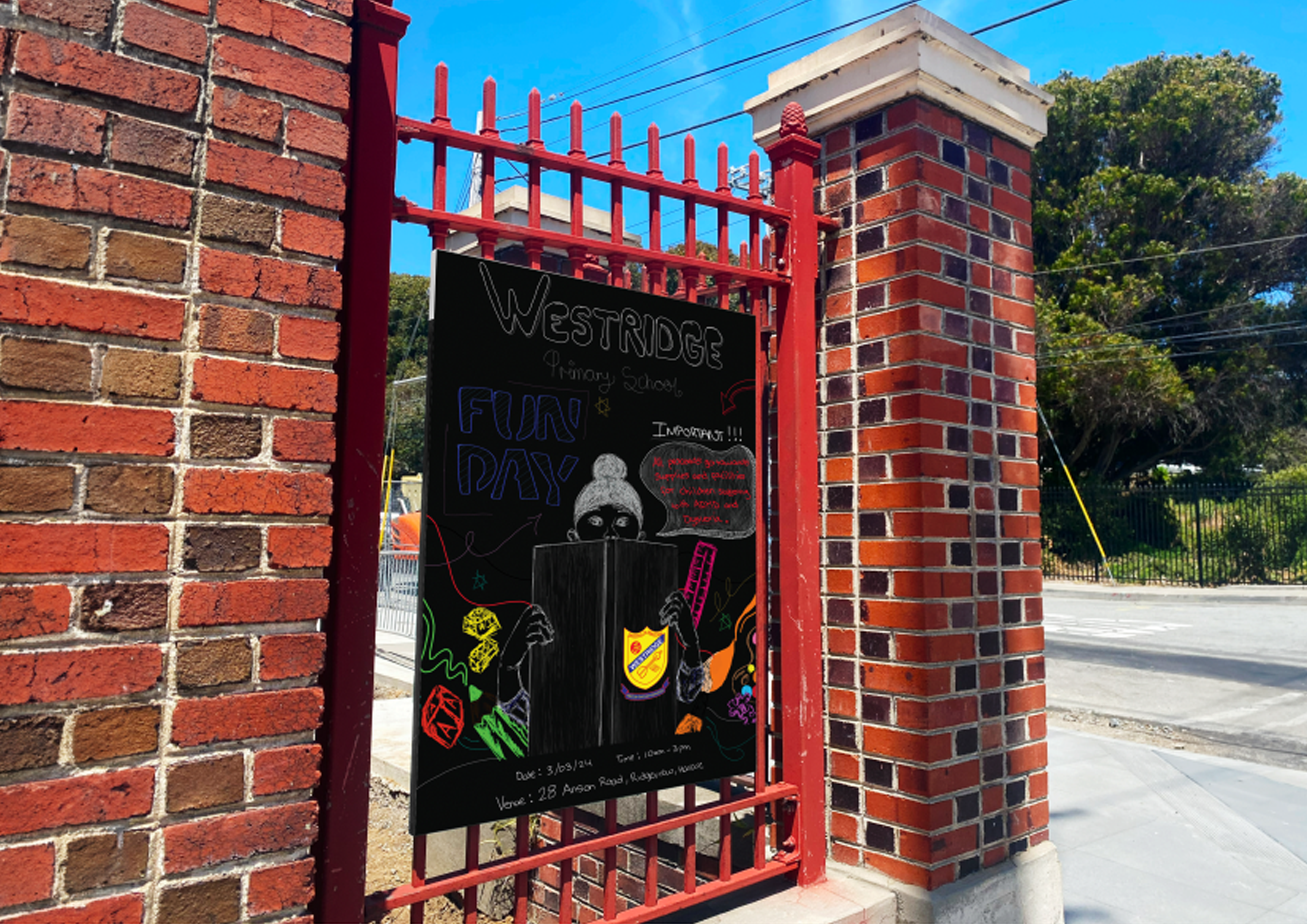
Poster: Designed to promote a fun day in which the proceeds would go towards the development of resources and training for the staff members.
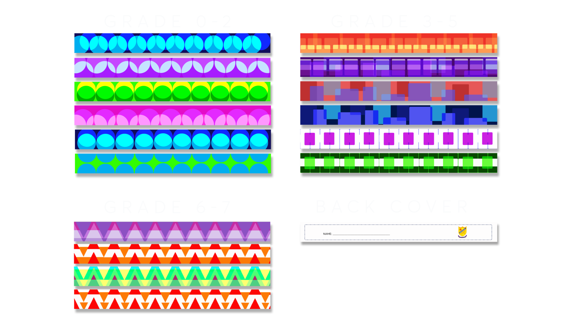
Guiding Cards: Specialized unique guiding cards or colourful bookmarks designed to help the children to focus on lines of text while reading. Software: Photoshop.
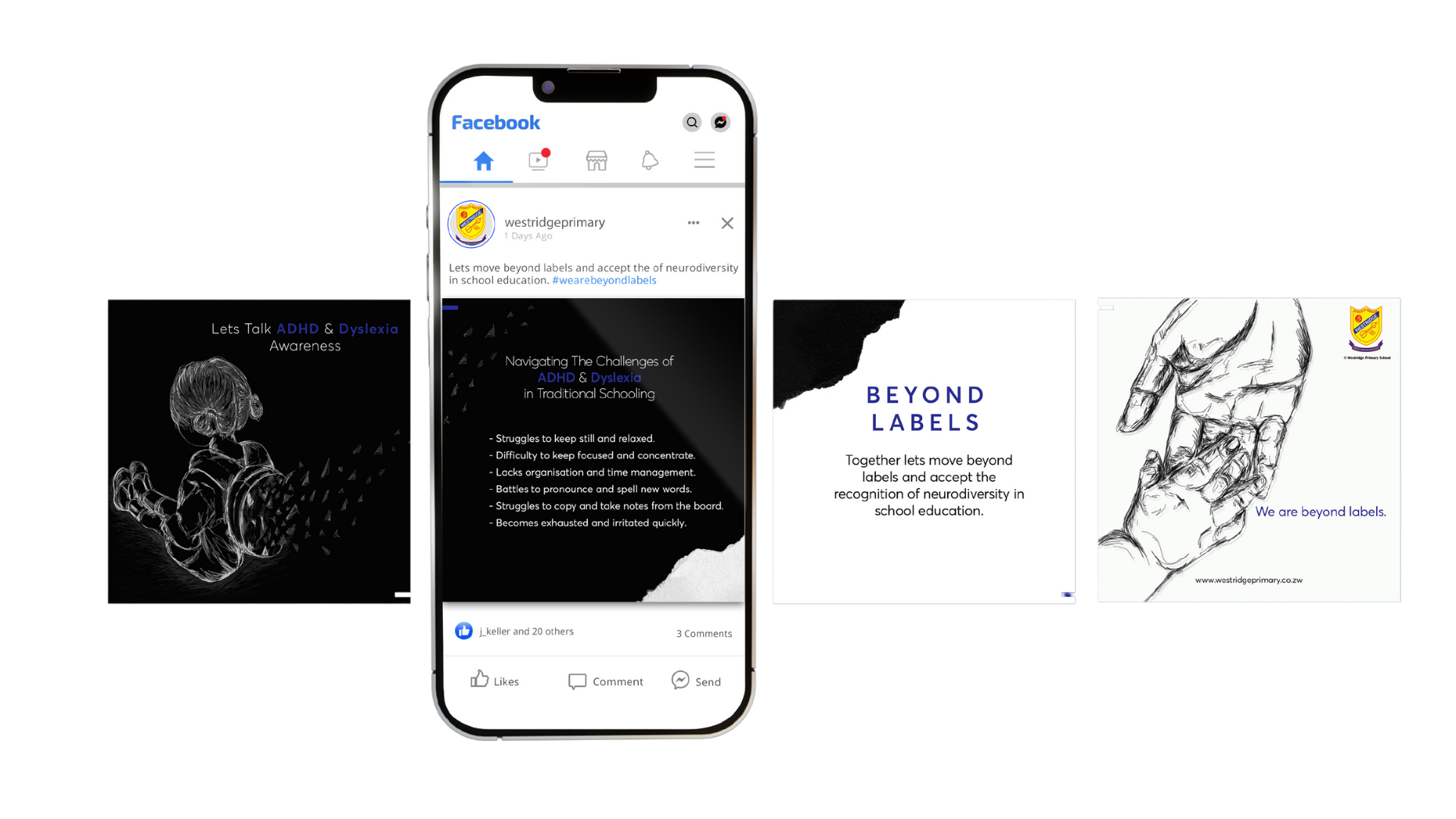
Facebook Carousel Directed to the current and potential parents that raises awareness of the difficulties and inconveniences for the children who have ADHD and Dyslexia.
Digital Media: Digital drawing
Software: Illustrator, Photoshop.
SKOON SKINCARE
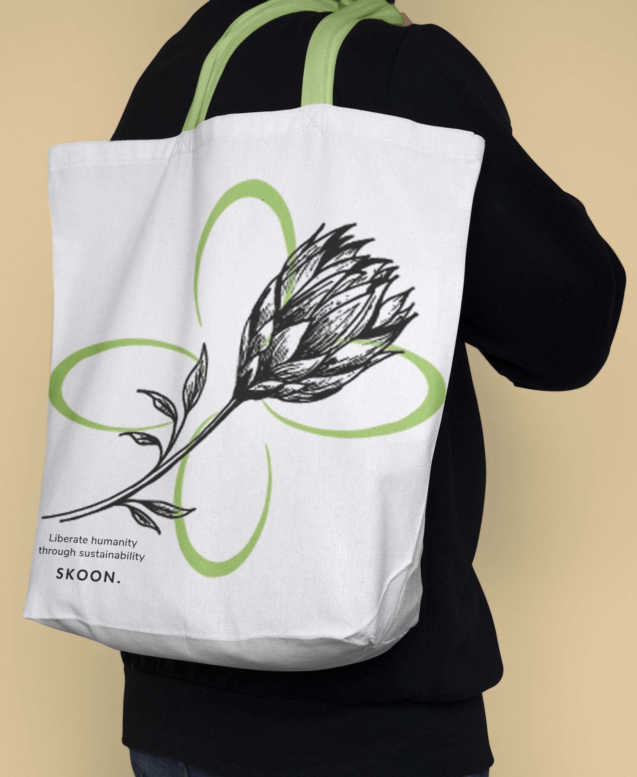
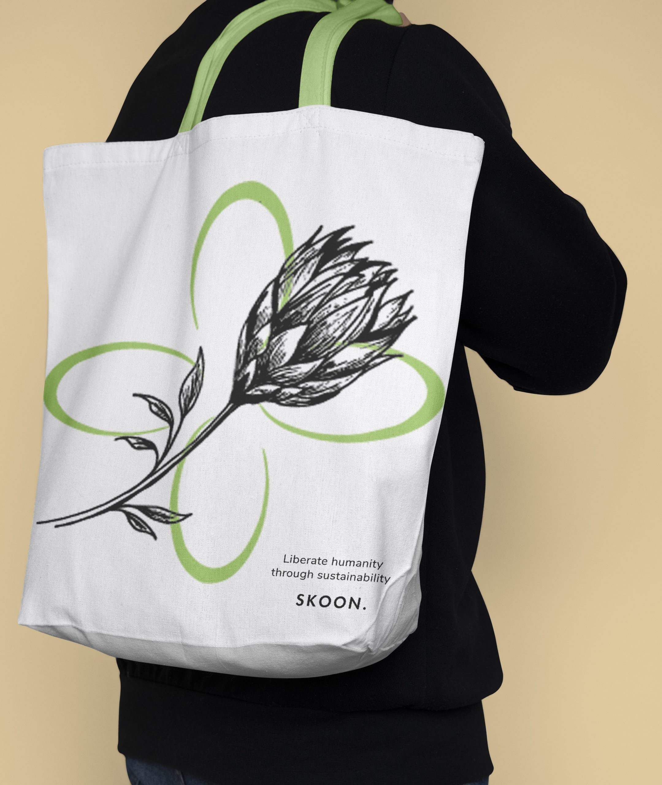
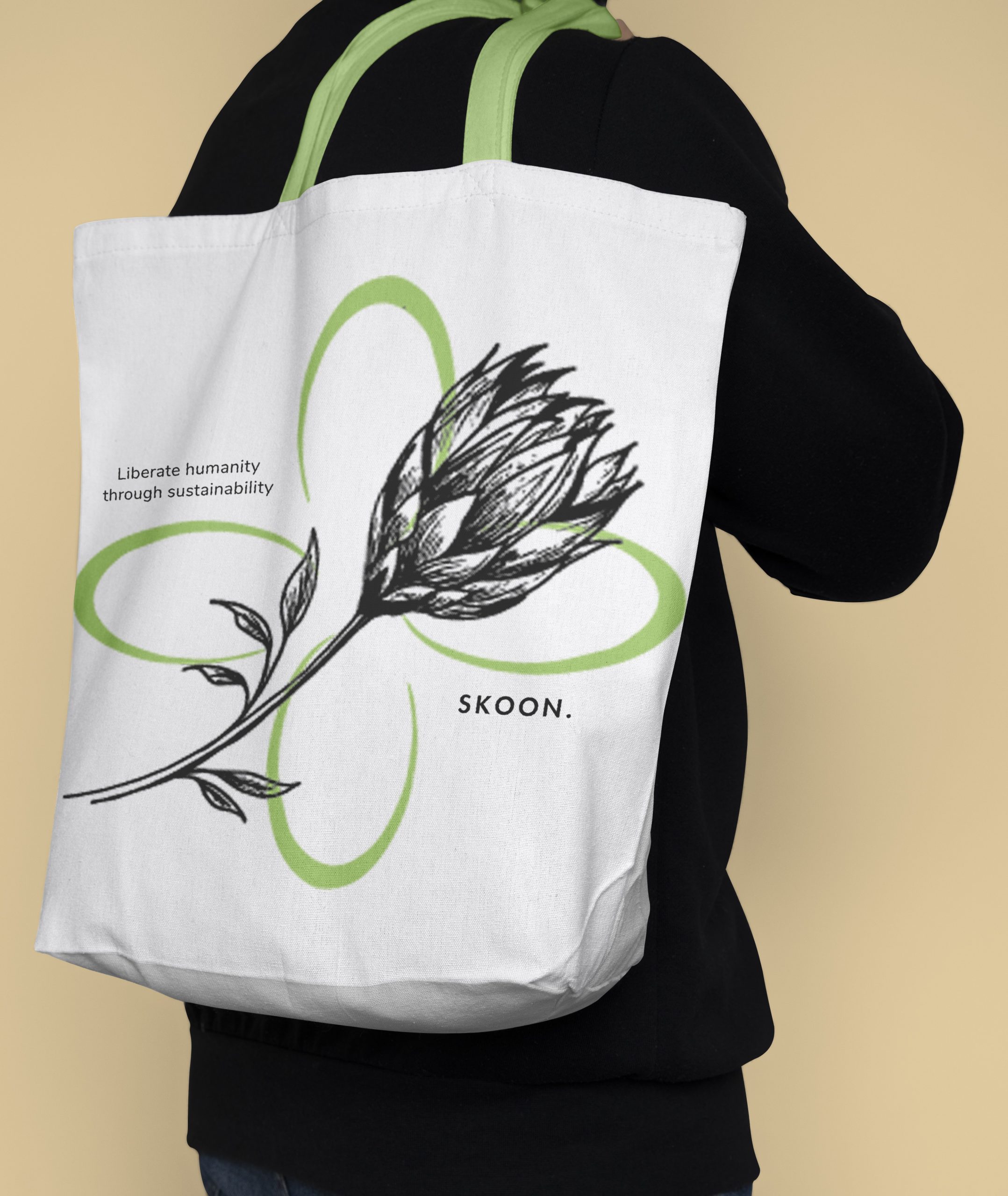
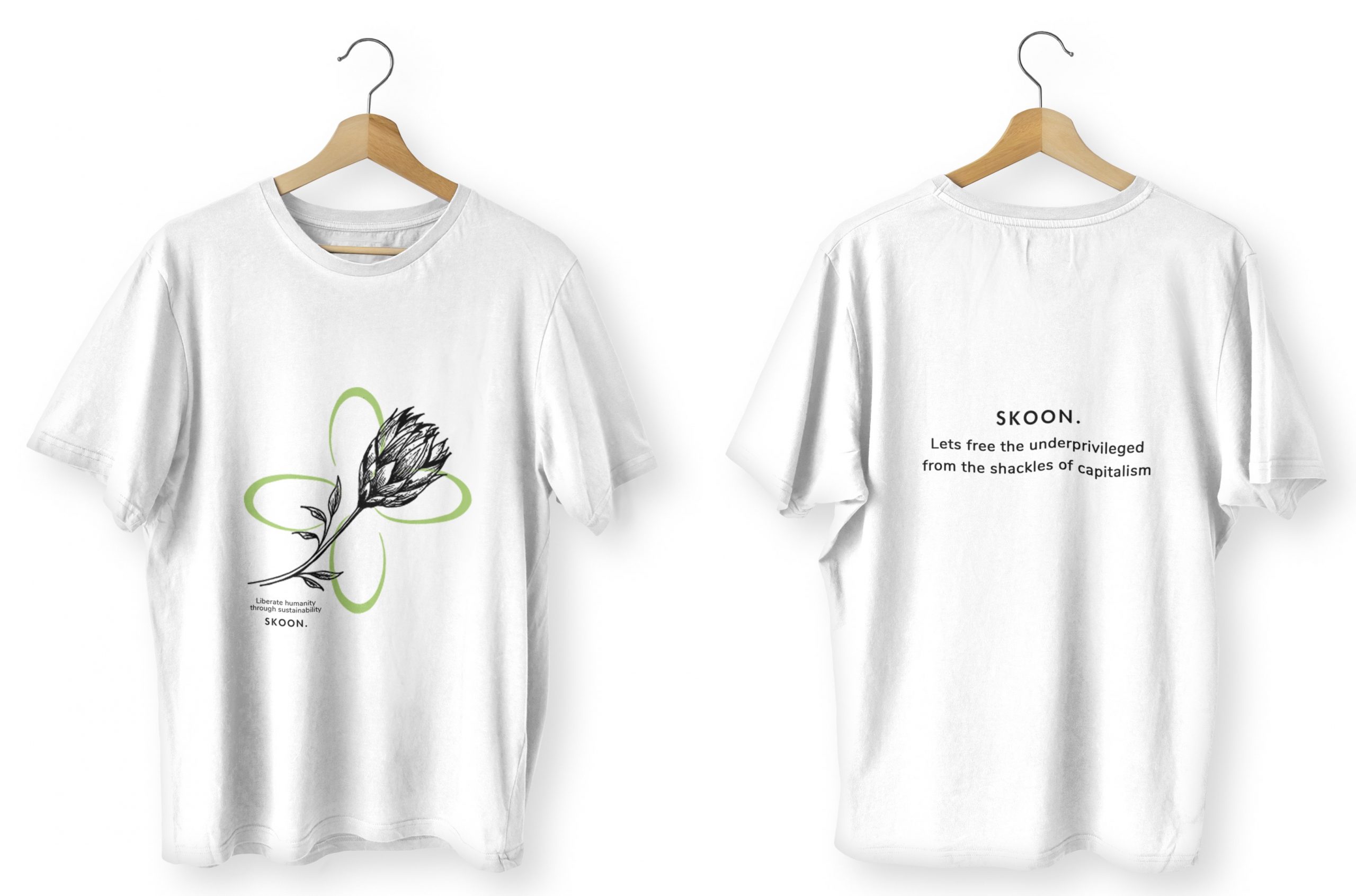
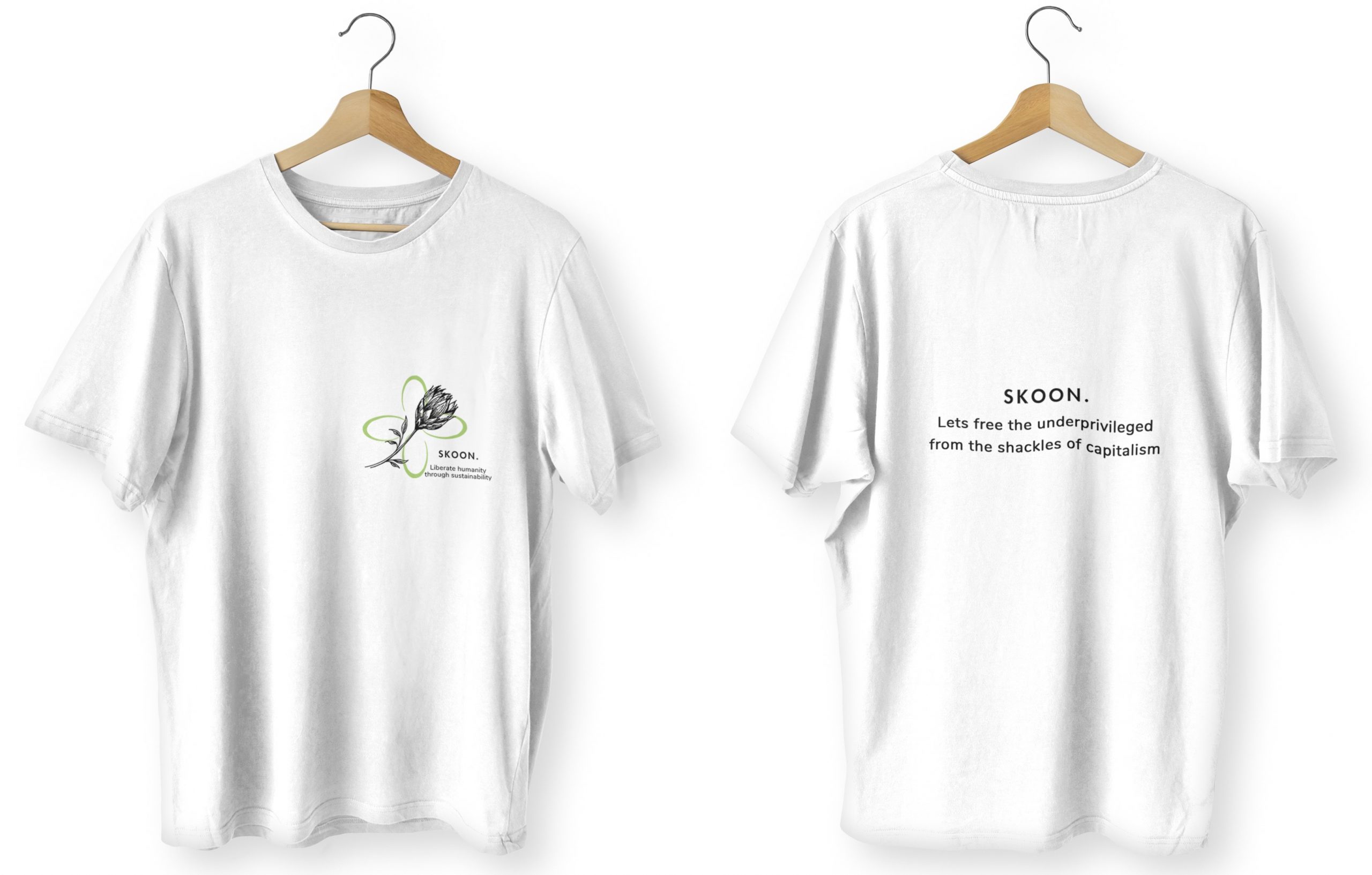
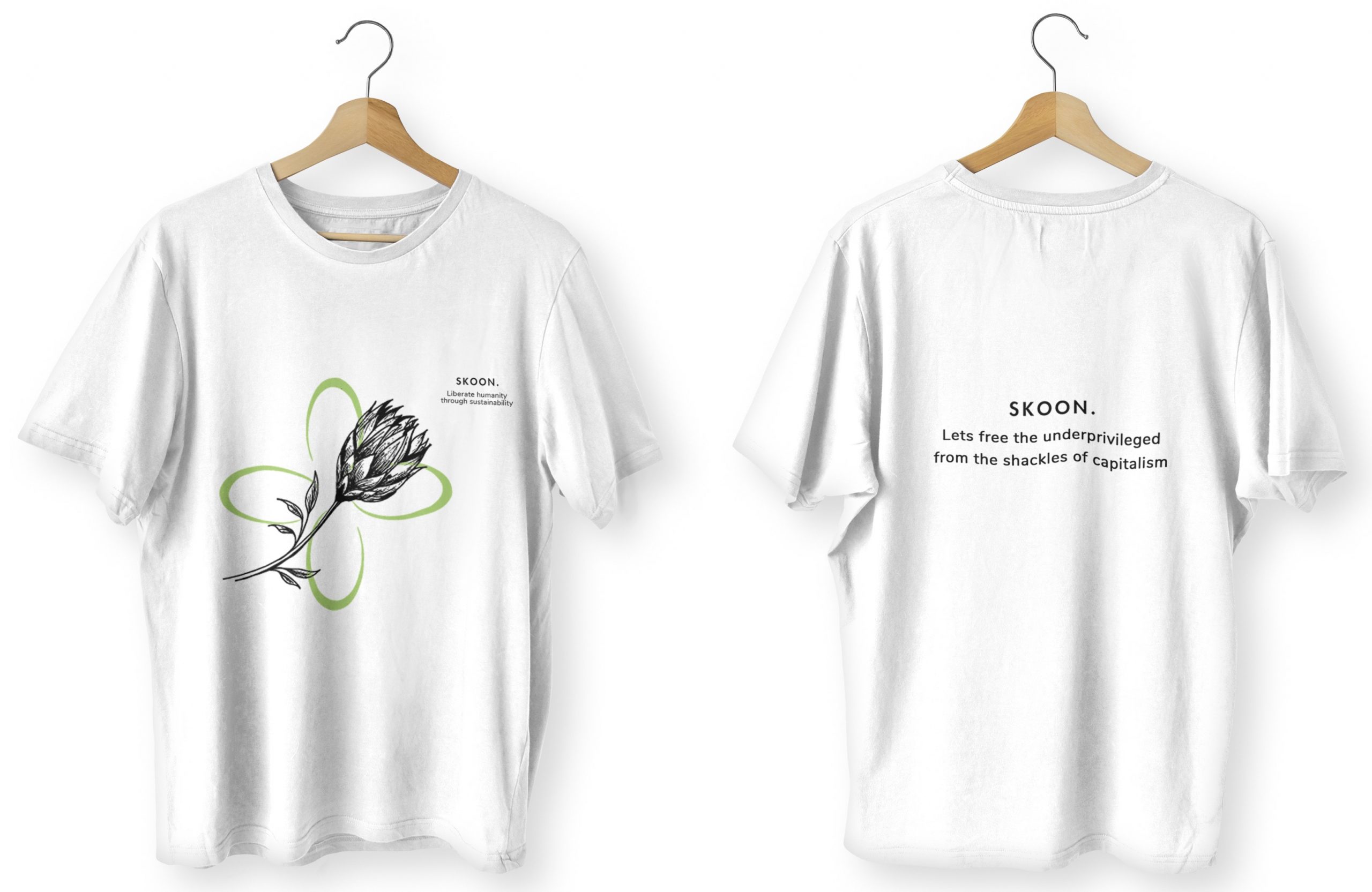
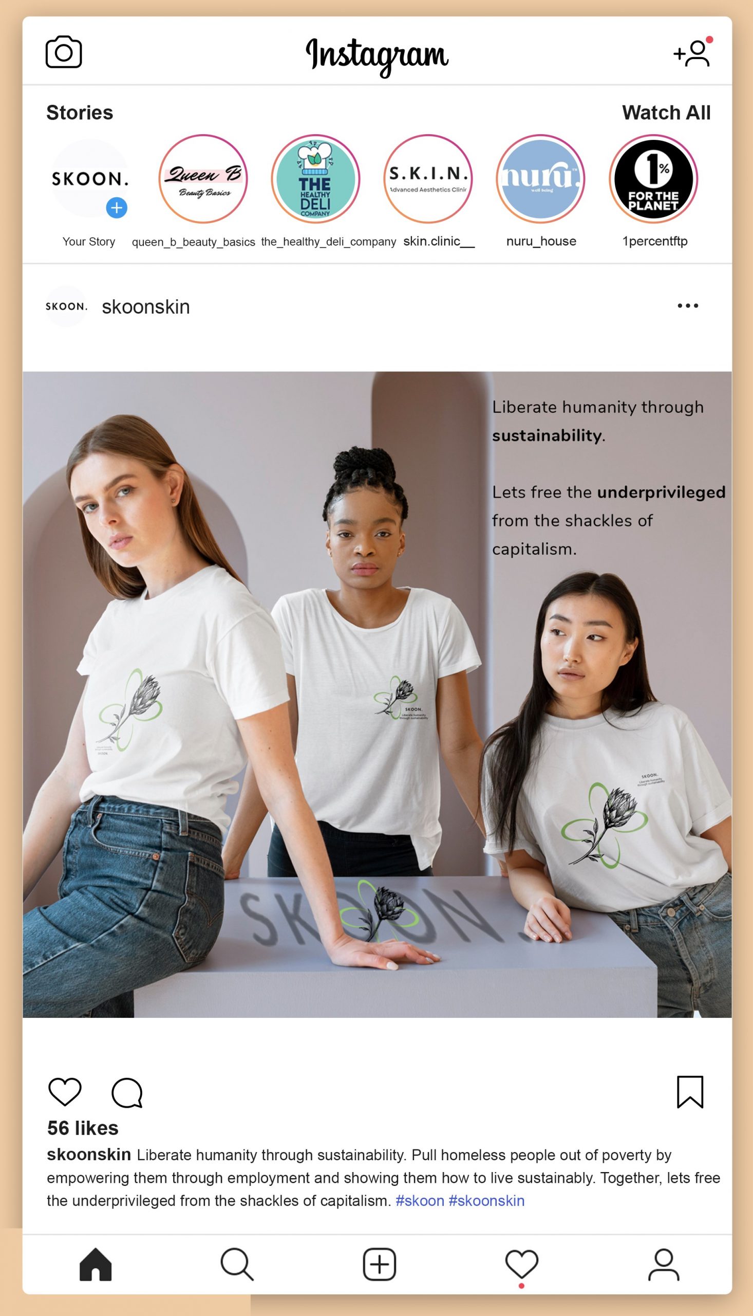
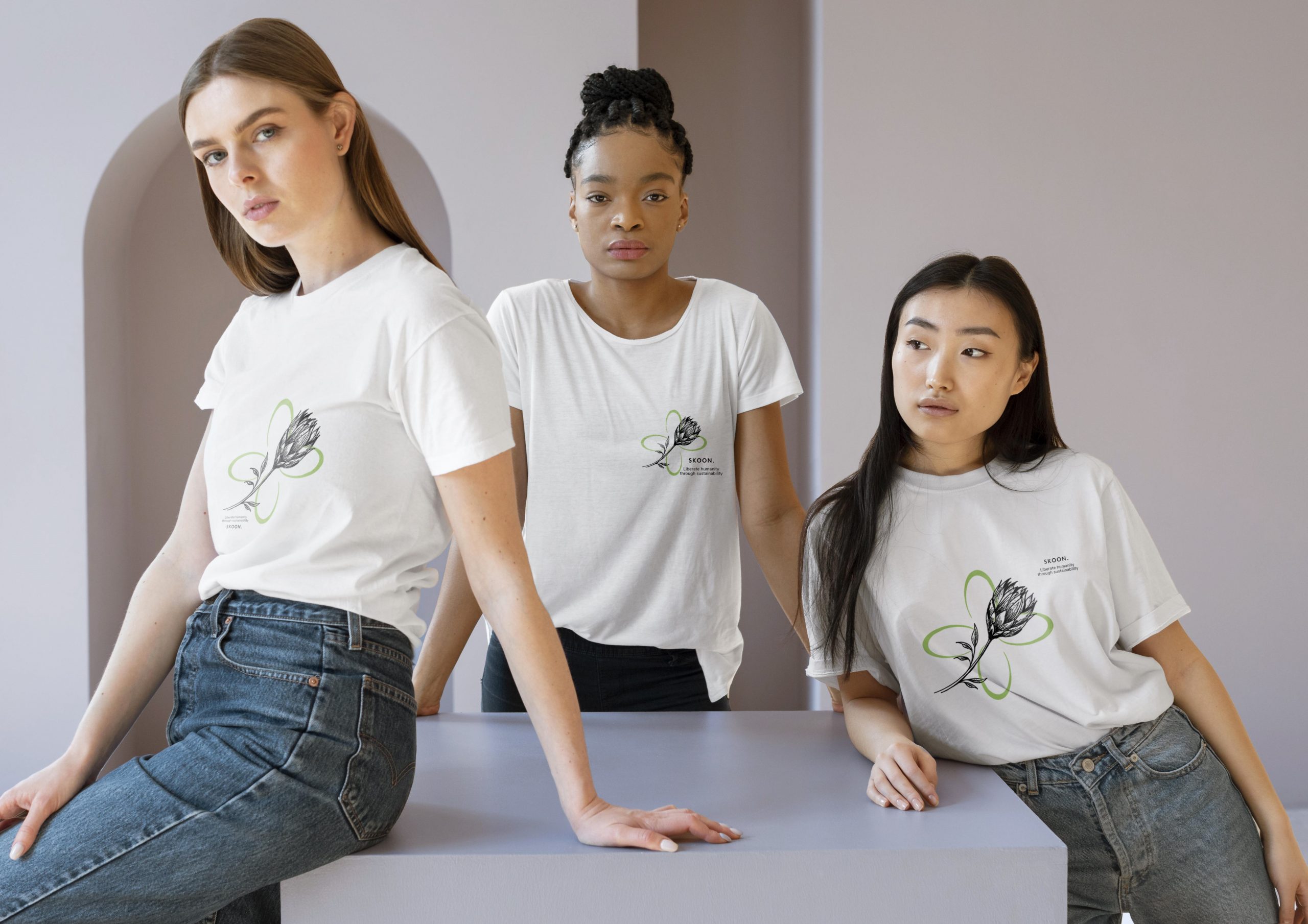
The challenge is to create a sustainability-focused campaign addressing South Africa’s high unemployment rate, aiming to capture the attention of a specific target audience. The campaign’s purpose is to communicate, draw attention and provide employment opportunities for the homeless and educate them on sustainable living. Through strategically designed deliverables, the campaign seeks to empower the homeless and the brand, giving them a voice while fostering unity and raising awareness about the critical issue of unemployment in South Africa.
The key insight involves tackling unemployment through a targeted social campaign for the homeless, anticipating a swift response to benefit the economy, while emphasizing the importance of sustainability in cosmetics by incorporating eco-friendly materials and waste reduction practices in alignment with the brand’s values.
The key message is to shift perceptions of homelessness, urging individuals to hire and educate the homeless, fostering a sustainable lifestyle by promoting the purchase of sustainable and recyclable products.
The concept for the campaign is “Liberate humanity through sustainability,” addressing South Africa’s high unemployment issue by providing job opportunities for the homeless through employment with Skoon. In this initiative, they would be involved in the packaging process, gaining education on sustainable materials and living practices. The fitting tagline for this concept is ‘Let’s free the underprivileged from the shackles of capitalism.’ This campaign consists of a packaging design, an Instagram post and a t-shirt print. ‘
Mixed Media: Fine liners, Graphite.
Software: Illustrator, Photoshop.
ILLUSTRATIONS
AMARULA
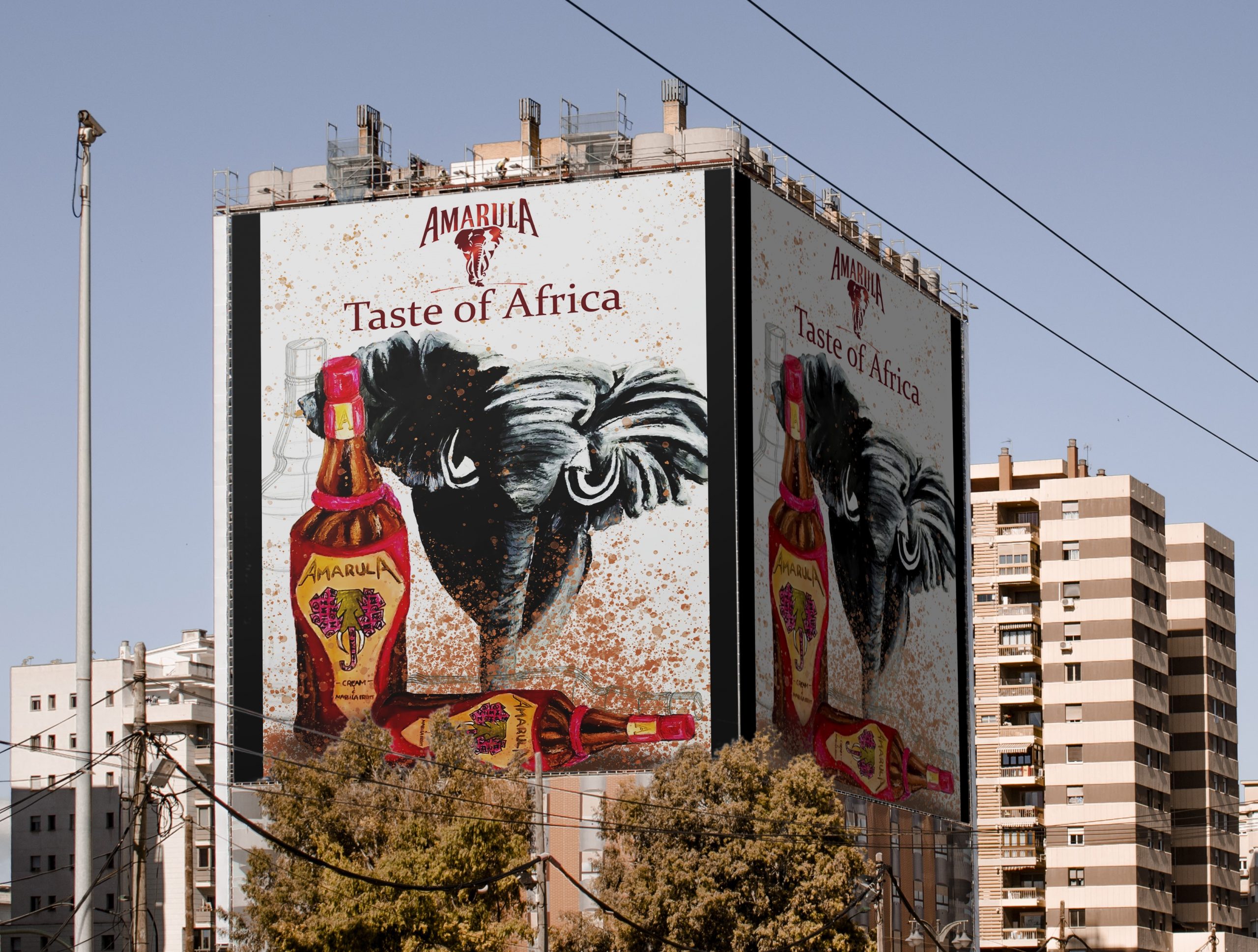
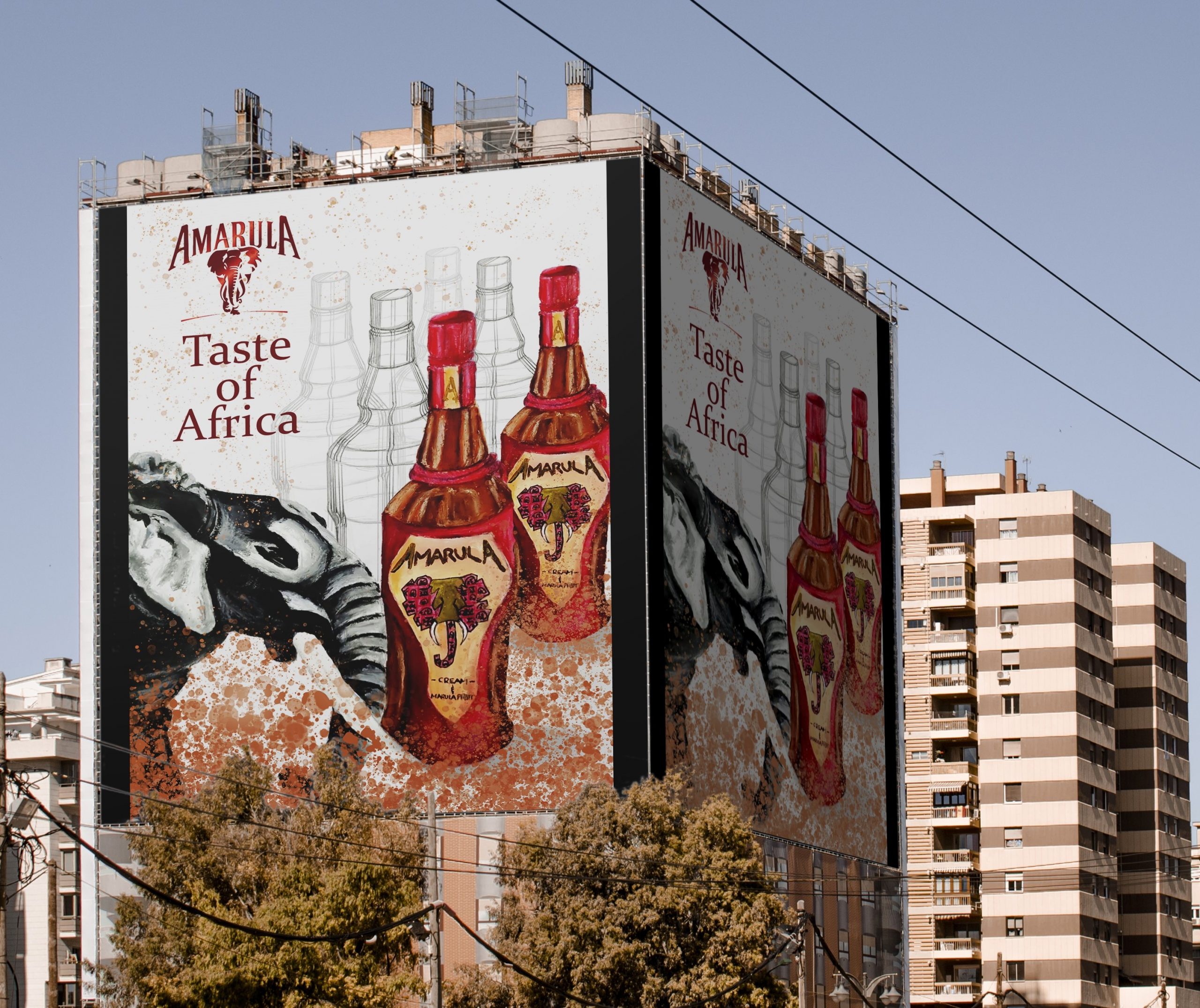
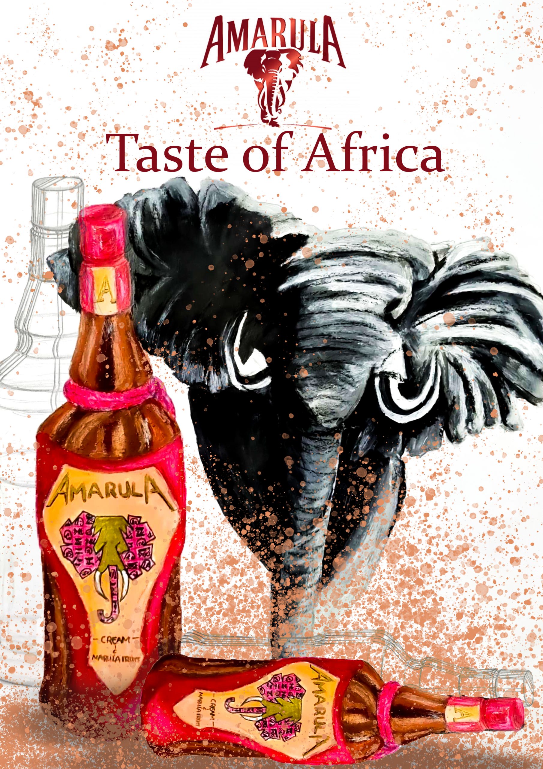
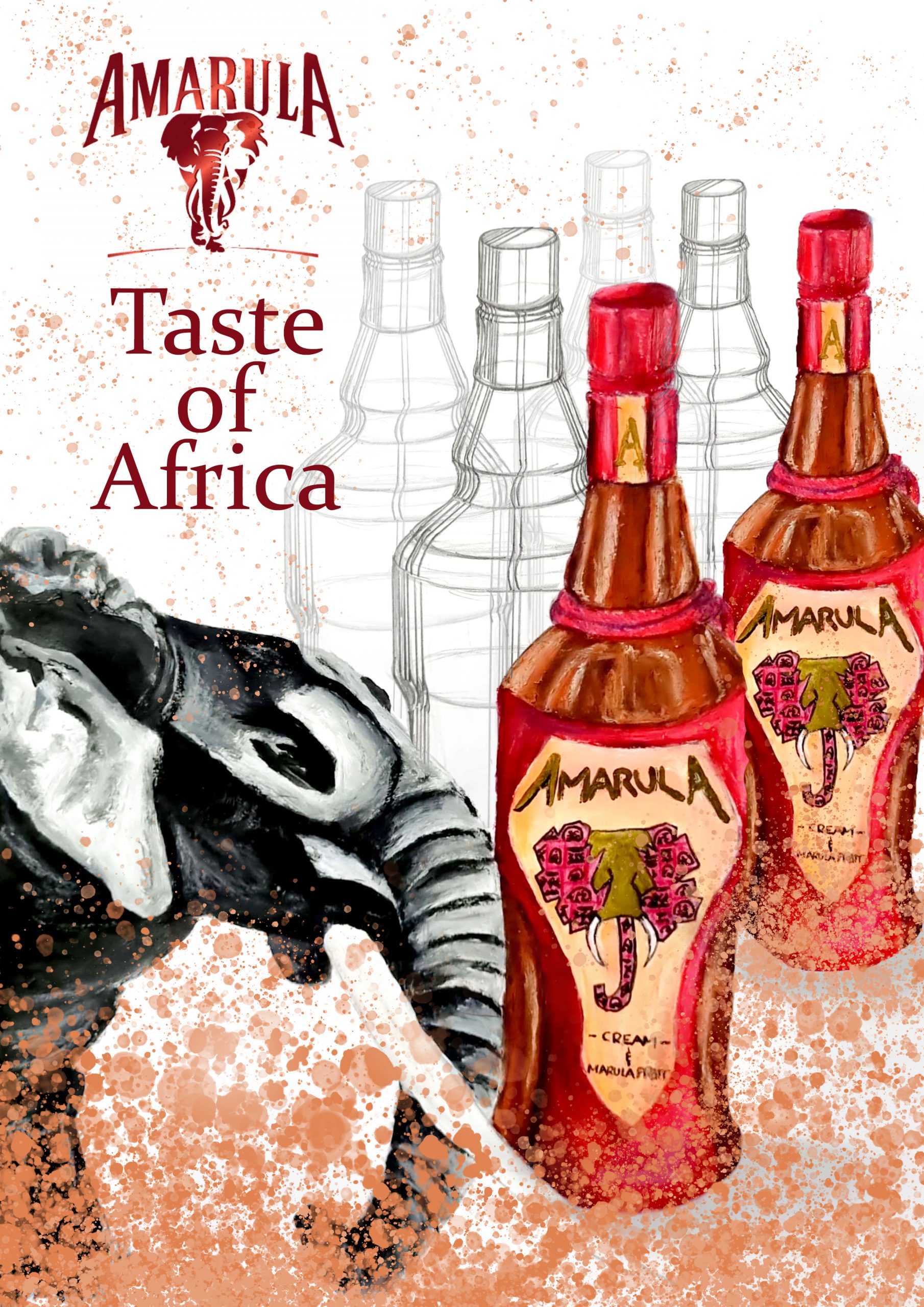
The outdoor advertising campaign aligns with the beverage brand Amarula, a creamy liqueur brand, focused on aligning with Amarula’s purpose, centered around preserving and safeguarding elephants and African heritage. Targeting viewers aged 18 and older, with potential appeal to younger audiences through illustrations (Amarula, 2022).
The campaign followed Amarula’s minimalist style. Emulating the brand’s typical approach featuring the Amarula bottle alongside an elephant image, the design aimed for realistic presentation through a blend of hand-drawn and digital mediums.
The concept, titled ‘Taste of Africa,’ creatively depicts droplets appearing to fall into the viewer’s mouth, symbolizing the creamy Amarula taste, while the direction of the droplets and images of elephants conveyed the essence of ‘Africa.
Mixed Medium: Acrylics, Oil Pastel, Colour Pencil, Photography, Technical drawing.
Software: Illustrator, Photoshop
